Competitive Magic
Our ongoing collaboration with Wizards across several IPs has manifested into some nice identity systems for competitive Magic and adjacent content. We’ve gathered some of that work together here, including the overall competitive Magic brand, a comprehensive broadcast / social package, and a tiered logo system that codifies competitive Magic across various formats.
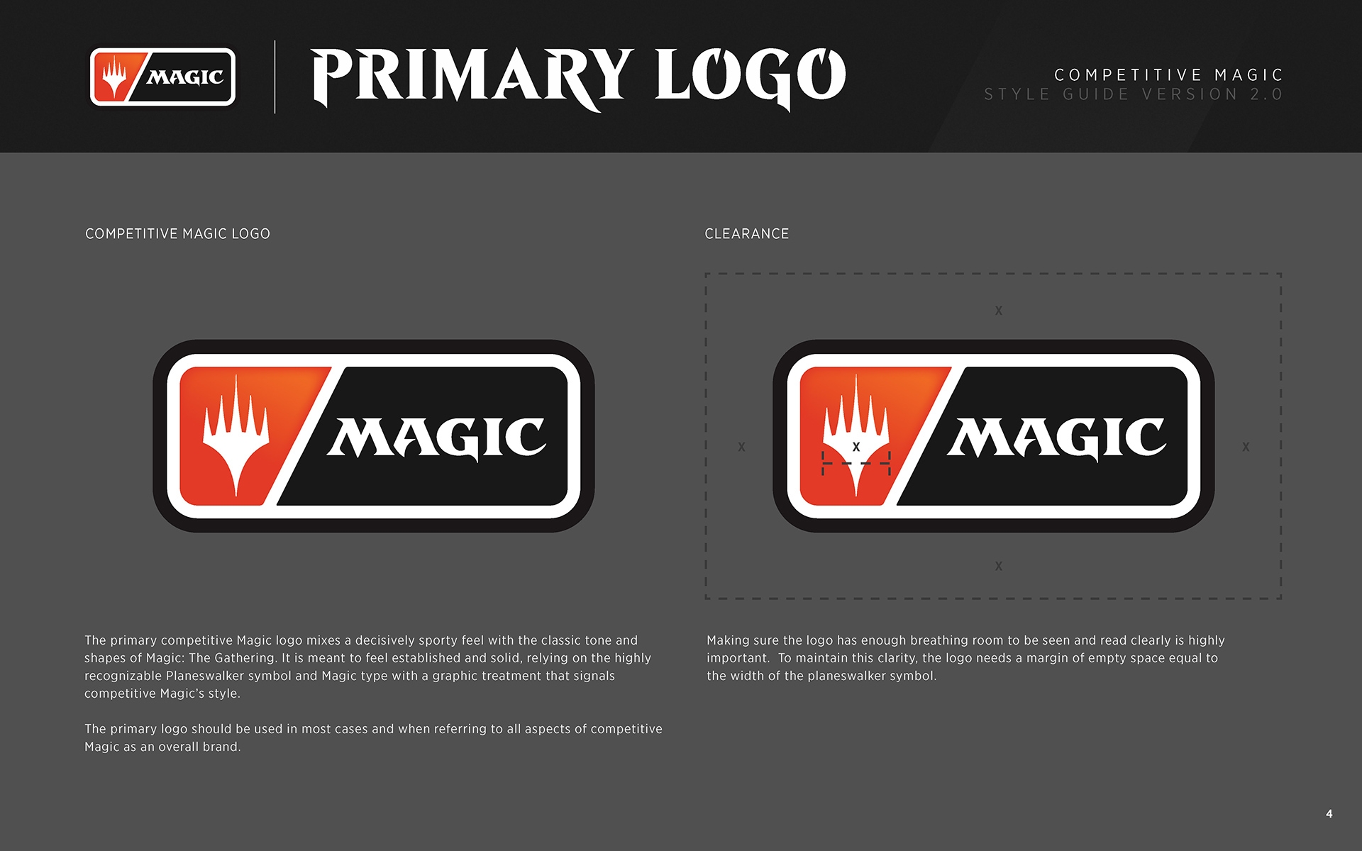
Our first phase of redefining the brand involved the creation of a new mark. We worked closely with the Wizards team through several iterations and eventually landed on this – it’s a descendant of the core MTG brand with the Planeswalker symbol and Magic typography reworked into a configuration that feels instantly recognizable as a pro competitive league.
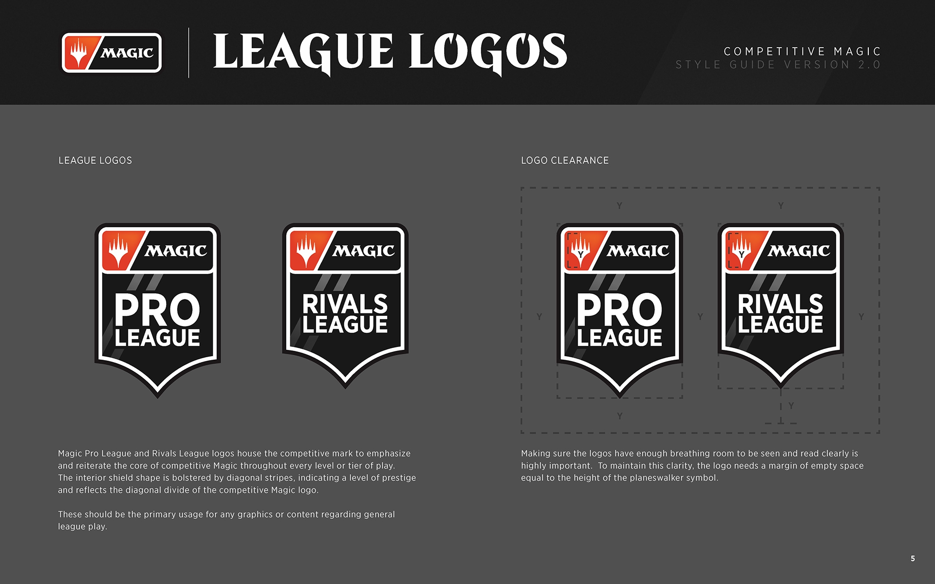
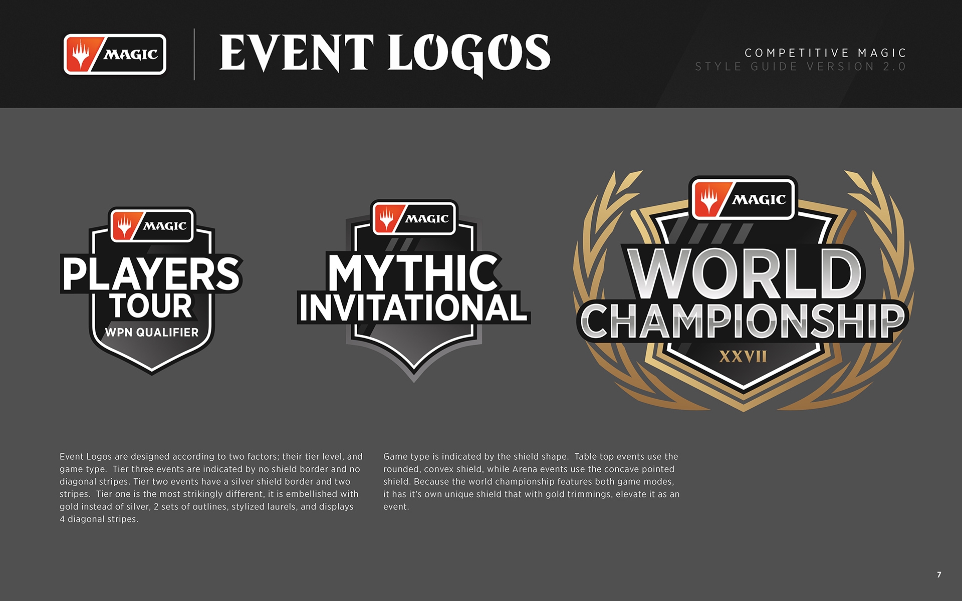
A key component of the new logo design was the ability for it to live effortlessly within dozens of league and event logos. Competitive Magic spans both tabletop and esports leagues, including events from the grassroots level all the way up to major World Championships.
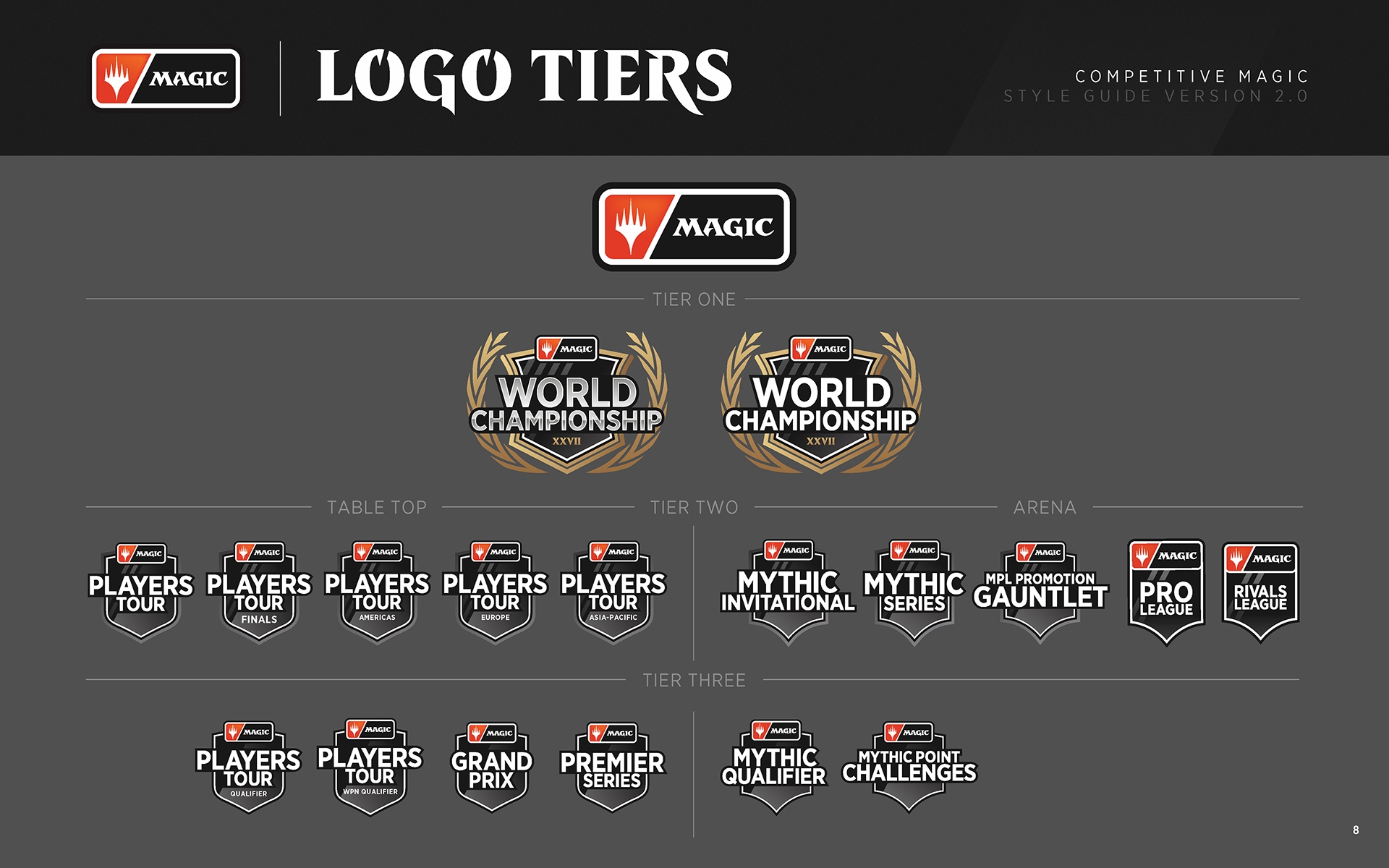
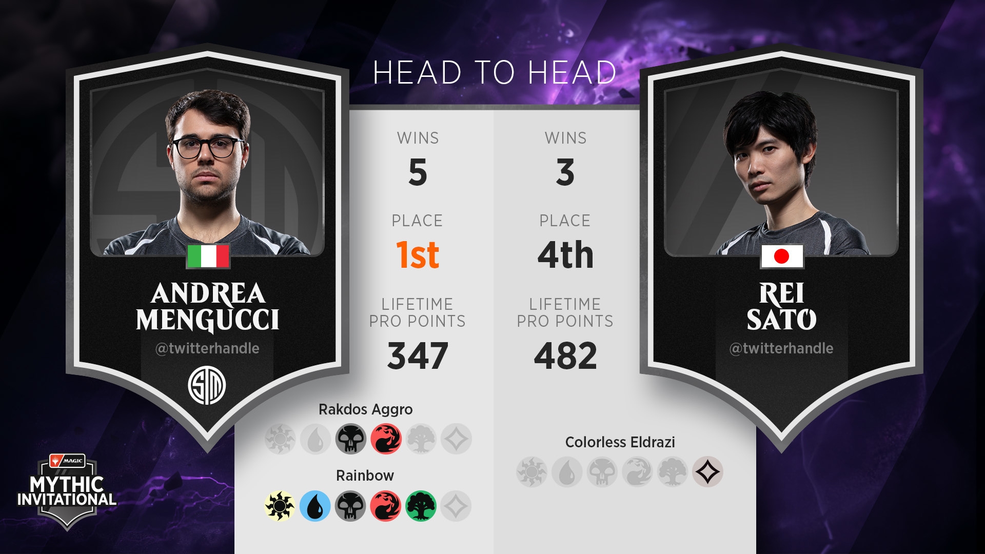
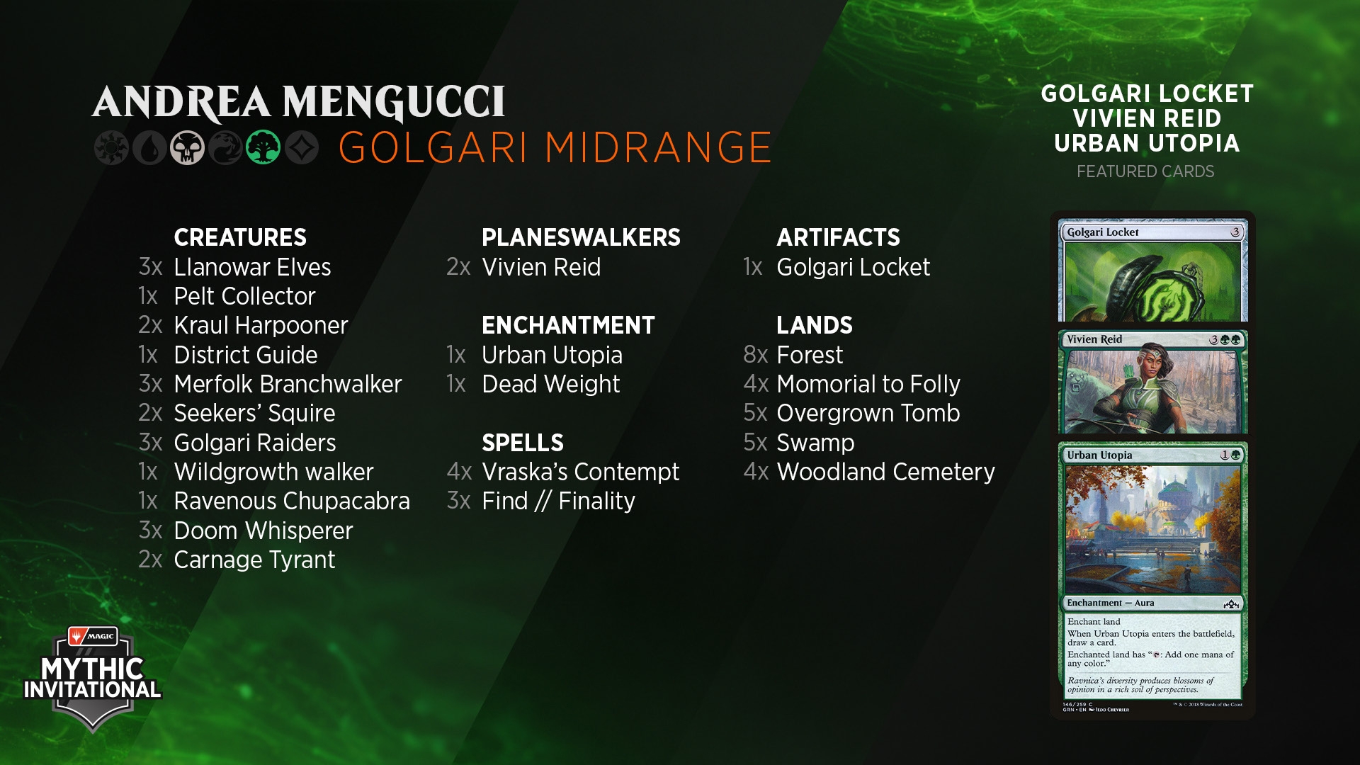
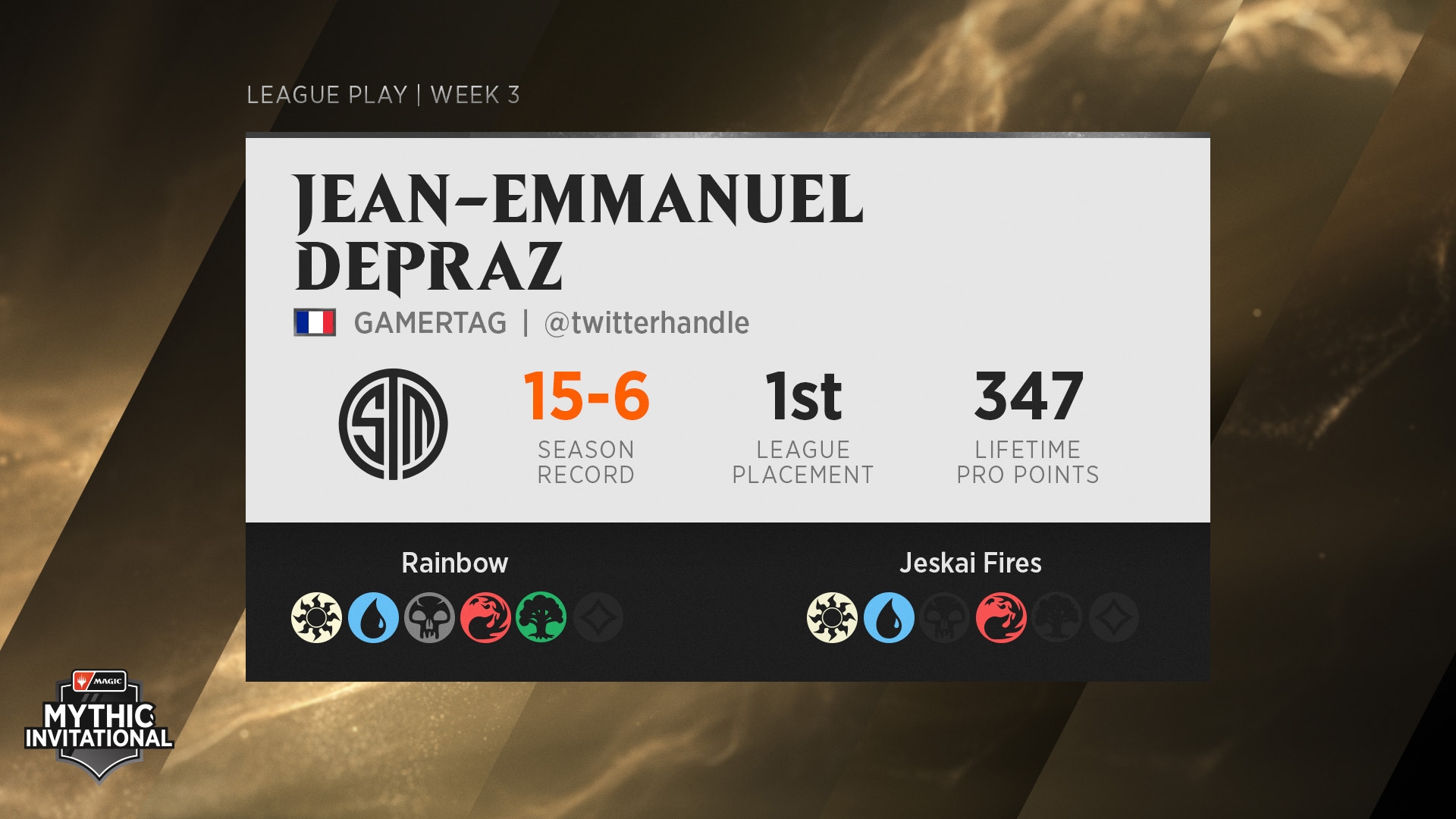
The shape language from the logo system also informs the broadcast package, using container shapes reflecting the competition format. The diagonal stripes from the logos are present as well, both as ambient design elements and persistent background motifs which interact with the various mana flows.
We also put together some hypothetical merch / official jerseys for players and judges to help inspire the various Wizards teams as they worked to apply the new branding across all touchpoints.
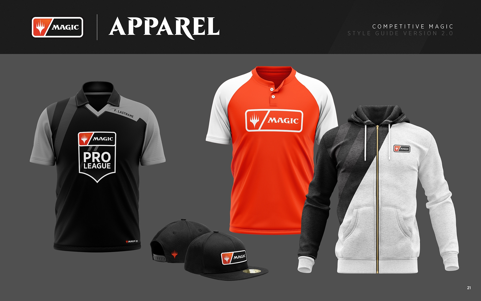
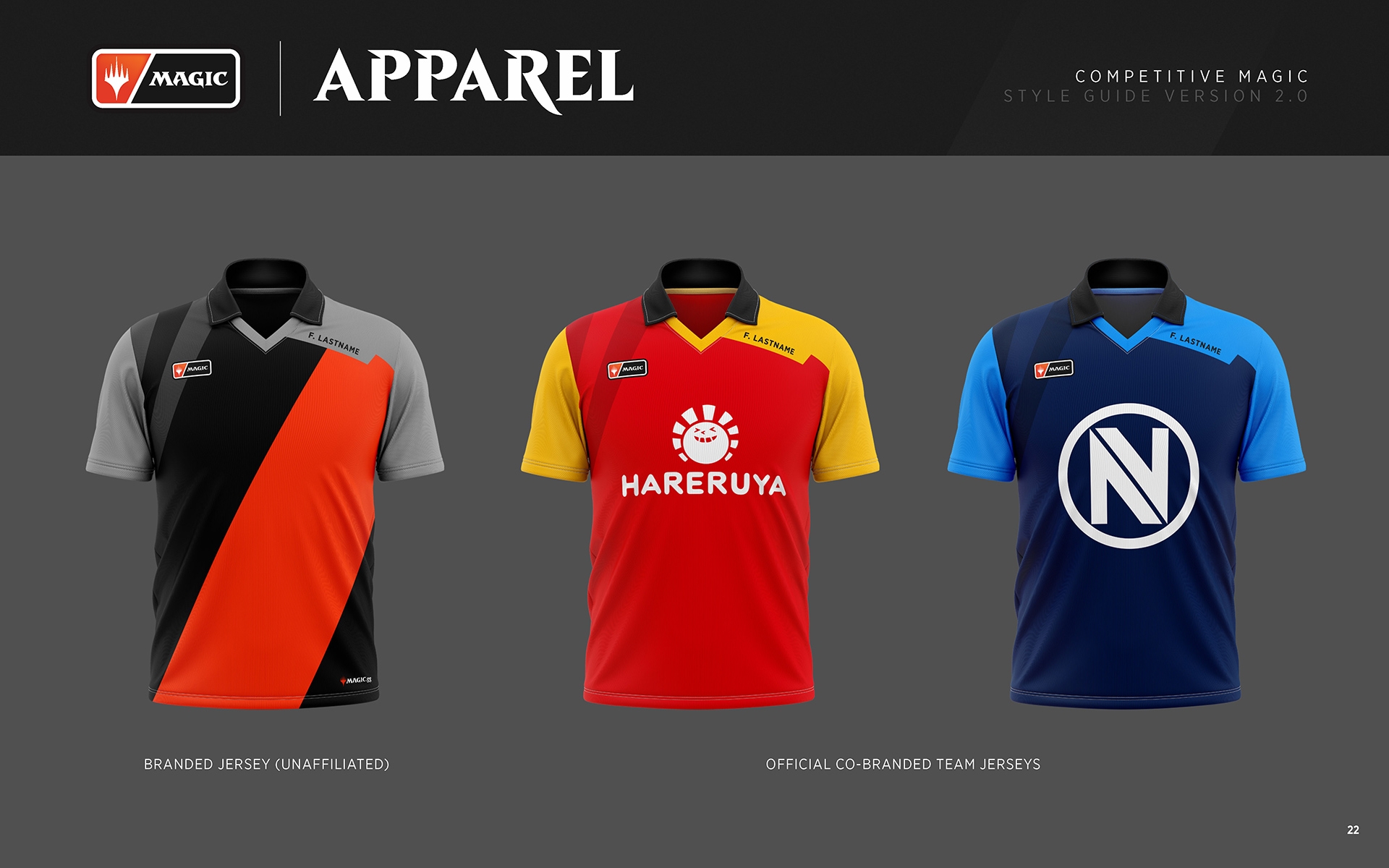
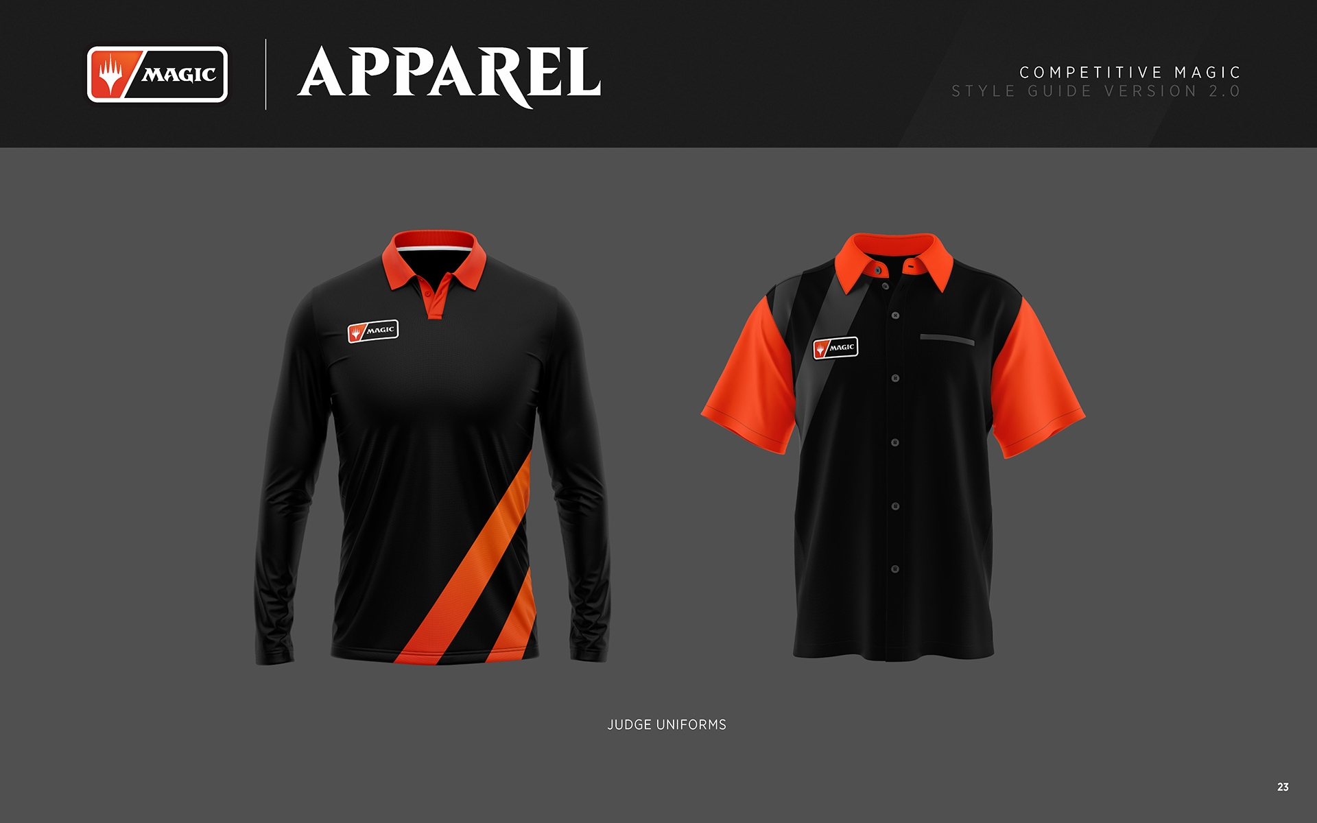
Finally, these social elements / explainer diagrams are a small portion of the social media toolkit we created as a starting point for the Wizards team. These particular elements are fairly technical, but they helped communicate some important structural changes to the loyal community of pro players and competitive Magic fans.
Capacity Studios
Client: Wizards of the Coast
Project focus: design + visual identity